
App Store Spotlight: Orbit - Time-Based Invoicing
Posted on April 17th, 2025
Discover how Orbit can boost visibility and conversions with smarter keywords, optimized creatives, and a stronger App Store presence.


With Valentine’s Day around the corner, dating apps are entering one of their busiest seasons. Singles are actively searching for platforms to connect, and the App Store is flooded with apps promising meaningful matches. Plenty of Fish Dating (POF), one of the more established names in online dating, is in a prime position to attract these seasonal users. However, does its App Store presence effectively communicate its strengths and differentiate it from the competition?
App Store Optimization (ASO) plays a crucial role in how users discover and choose dating apps. A well-optimized title, subtitle, icon, and screenshots can make the difference between a download and a scroll-past. With competitors like Hinge setting a high standard, POF has room to refine its ASO strategy to stay competitive. In this spotlight, we’ll analyze its current App Store presence, highlight its strengths and weaknesses, and provide actionable insights for improvement.
POF’s current title, "Plenty of Fish Dating", follows an ASO-friendly format by incorporating a high-value keyword: "dating." This immediately informs potential users of the app’s purpose and increases its visibility in search results. Including "dating" also helps those unfamiliar with the POF brand understand what the app offers at a glance.
However, while this title is functional, it lacks the extra appeal that could make it more compelling. Many competing apps use similar structures, meaning POF risks blending in rather than standing out. A stronger approach could involve incorporating a phrase that highlights a unique value proposition, such as:
Adding a more descriptive phrase could improve conversion rates by immediately addressing what users are looking for: a platform that enables meaningful dating experiences.
POF’s current subtitle, "POF - date, chat, meet singles," attempts to touch on key dating app functions, but there are clear opportunities for improvement.
A refined subtitle should maintain relevant keywords while making the phrase more engaging and actionable. Potential alternatives include:
By making these adjustments, POF can better align its messaging with what potential users are looking for, improving both search rankings and conversion rates.
POF’s icon is one of its stronger elements. The design cleverly incorporates a fish shape into the letter “P,” creating a visual identity that is both simple and recognizable. This aligns well with the app’s branding, making it easier for users to remember.
However, in a highly competitive market, even strong branding can benefit from periodic updates. Competitors frequently refresh their icons to stay modern and visually appealing. POF might consider subtle refinements, such as:
These minor enhancements could improve POF’s visibility and appeal, helping it stand out in crowded search results.
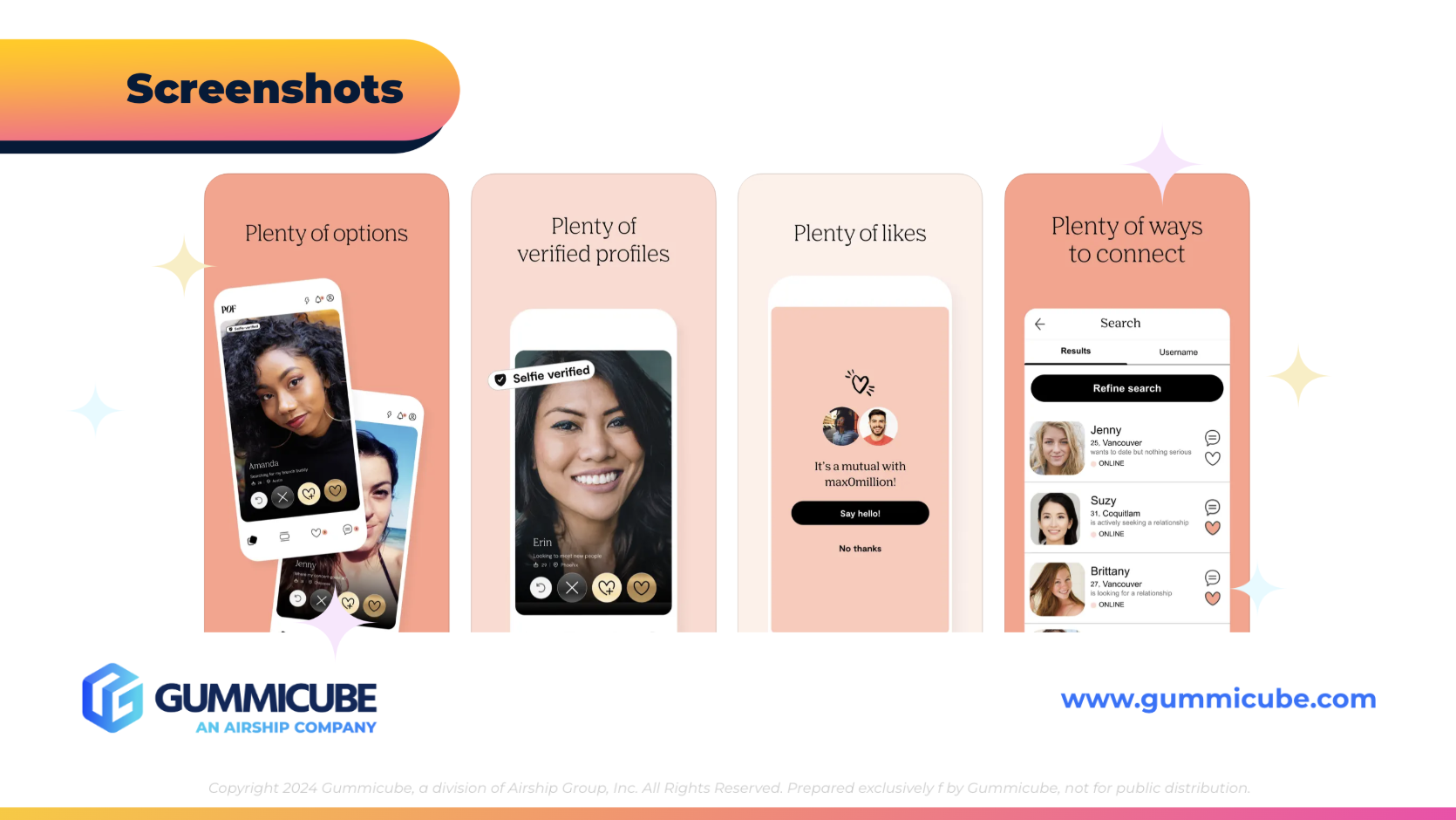
POF’s current screenshots take a straightforward approach: they feature varying shades of orange backgrounds with text overlays and simple iPhone mockups displaying the app interface. While this creates a clean visual experience, it lacks the engaging elements that can make an app feel more dynamic and appealing to potential users.
Enhancing the screenshots with these strategies could help improve user engagement and encourage more downloads.
One major missed opportunity for POF is the absence of a preview video. Videos are proven to increase conversions, as they allow potential users to experience the app before downloading. A well-crafted preview video could showcase:
Adding a preview video could give POF a competitive edge by making the app feel more dynamic and inviting.
To see where POF stands in comparison, let’s examine how Hinge—a direct competitor—approaches its App Store presence.
Compared to POF’s more generic phrasing, Hinge’s wording feels intentional and optimized for both engagement and discoverability.
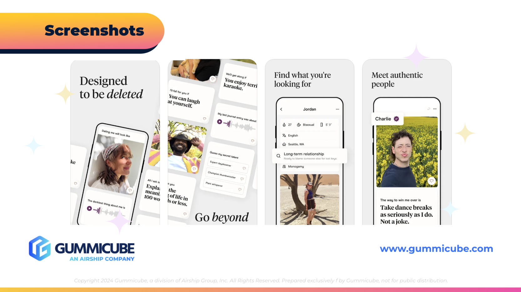
Hinge’s screenshots take a more polished approach:
When placed side by side, Hinge’s screenshots feel more engaging, structured, and strategically designed to encourage downloads. POF could benefit from adopting some of these tactics while maintaining its own brand identity.
Hinge’s ASO strategy serves as a great example for dating apps looking to improve their presence in the App Store. It demonstrates how strong keyword usage, compelling messaging, and engaging visuals can work together to maximize conversions.
Hinge’s success in ASO isn’t just about branding—it’s about making every App Store element work together to tell a compelling story. Dating apps, including POF, should take note and refine their approach to stay competitive in an ever-growing market.
Plenty of Fish Dating has a solid foundation in the App Store, but there are clear areas for improvement. While the title effectively incorporates key search terms, the subtitle and screenshots could be optimized for better engagement and conversion rates.
With Valentine’s Day approaching, now is the perfect time for dating apps to refine their App Store presence. A stronger subtitle, more visually engaging screenshots, and the addition of a preview video could help POF attract more seasonal users and increase downloads. By making these strategic updates, POF can enhance its positioning and stay competitive in a crowded market.
ASO is a continuous process, and even small changes can lead to significant improvements in visibility and conversion rates. Gummicube has 15 years of experience in data-driven ASO strategies that help apps maximize their potential in the App Store. If you're looking to fine-tune your app's presence and stay ahead of the competition, let’s connect.
Discover how Orbit can boost visibility and conversions with smarter keywords, optimized creatives, and a stronger App Store presence.

Explore how Home Contents can improve its App Store listing with smarter ASO tactics, from stronger keywords to better screenshots and video strategy.

Discover how onX Offroad can enhance its App Store presence with smarter ASO strategies, from metadata tweaks to creative optimizations.