App Store Spotlight: Orbit - Time-Based Invoicing
Posted on April 17th, 2025
Discover how Orbit can boost visibility and conversions with smarter keywords, optimized creatives, and a stronger App Store presence.

Following Apple's new App Store Guidelines concerning the sale of cannabis in states where consumption has been legalized, Eaze launched the first full service cannabis shopping app last week. With Eaze’s update to version 3.0, we’ll take a look at how their product page has changed to reflect new features and how these changes could impact their visibility on the App Store.
Following the Worldwide Developers Conference 2021 on June 7th, Apple released changes to the App Store Review guidelines. Among these changes, an update to the section entitled “Physical Harm” had been considered a long awaited change, and will enable many developers to bring full functionality to their cannabis-based apps.
Apple has updated restrictions on the sale of controlled substances to permit licensed cannabis dispensaries to operate where cannabis use is legal:From: 1.4.3 [...] Facilitating the sale of controlled substances (except for licensed pharmacies), marijuana, or tobacco is not allowed.To: 1.4.3 [...] Facilitating the sale of controlled substances (except for licensed pharmacies and licensed or otherwise legal cannabis dispensaries), or tobacco is not allowed.
This change to restrictions on the sale of controlled substances has enabled apps that operate licensed cannabis companies to sell and distribute their products, as long as these features are geo-restricted to areas where cannabis use has been legalized. Eaze is the first cannabis app to take advantage of these loosened rules, although many apps are sure to follow.
Eaze has operated on the iOS App Store since late 2016, but it has expanded and developed greatly since its initial release. While the Eaze website has enabled medical marijuana patients—and later, recreational users—to order cannabis products online, the app had been restricted to browsing products and tracking deliveries. Now users can take advantage of the full functionality of Eaze in their convenient app.

The title and subtitle fields on the Apple iOS App Store are crucial for both discoverability and conversion. Each field has a 30 character limit, and they both work in tandem with the backend keyword bank to build keyword phrases. Each individual word is assessed and combined with other words included in these three fields, so this is the place to include high-volume keywords. It is important, however, to also make sure these fields are relevant and readable for users who are searching the App Store.
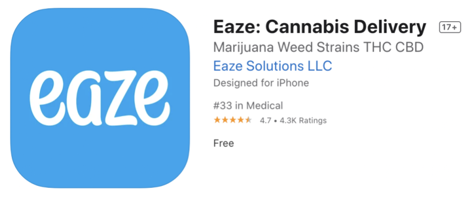
The title with title tag “Eaze: Cannabis Delivery” communicates the purpose of the app well, and includes the high-volume terms “cannabis” and “delivery”. While it is only taking advantage of 23 of the possible 30 characters, it is still a good start to the listing.
Eaze’s subtitle “Marijuana Weed Strains THC CBD”, at a full 30 characters, is packed with high-volume keywords. Unfortunately for users, this subtitle doesn’t do much to explain the app, except that it is related to cannabis and all its colorful names. It is important to keep front-facing metadata fields readable, and as near to full sentences as the space allows. Not only does this make reading a more pleasant experience for users, but Apple states that developers should “avoid keyword stuffing throughout your metadata” and it is always best to adhere to Apple’s guidance to avoid a potential metadata rejection.
Altogether, Eaze was able to completely revamp their description, removing the disclaimer that users would need to leave the app to make purchases online. There is now a huge emphasis on getting cannabis on-demand, delivered right to your door.
Creative

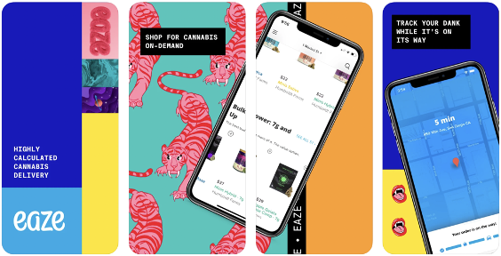
Eaze’s screenshots on the iOS App Store are bold and colorful, with pops of patterns against contrasting background colors. In-app imagery is displayed in device frames that span across multiple images, creating movement and guiding the user to view the entire set. The overall impression is of a trendy, hip company that appeals to the 35 and under demographic.
The icon, however, pales in comparison with its light blue coloring and only the app name with no additional treatment. Eaze could experiment with a simple yet bold pattern in the icon that appeals to the same crowd.
While the screenshots do a good job of incorporating design styles popular among Eaze’s targeted demographic, the text callouts are quite small. Text callouts serve the important role of adding value propositioning and highlighting notable features. Eaze’s text callouts are on-brand with the screenshots, with a funky monospace condensed type that reminds readers of a typewriter, but they are hard to read on smaller screens. Keeping the same style and increasing the size could help users better understand what Eaze is all about- and especially what is new.
Apple’s recent updates to the App Store Review Guidelines have opened the door to cannabis retailers wishing to bring their business into the 2020s on the iOS App Store. While many more are sure to come, Eaze is the first of its kind, with version 3.0 bringing the full functionality of the Eaze website to the mobile realm.
Users can research, search, buy, and have cannabis delivered right to their door. While Eaze may be the first app to take advantage of new regulations, they will need to maintain and improve their ASO strategy if they want to keep the spotlight as other well-known apps expand their functionality.

Discover how Orbit can boost visibility and conversions with smarter keywords, optimized creatives, and a stronger App Store presence.

Explore how Home Contents can improve its App Store listing with smarter ASO tactics, from stronger keywords to better screenshots and video strategy.

Discover how onX Offroad can enhance its App Store presence with smarter ASO strategies, from metadata tweaks to creative optimizations.