App Store Spotlight: Orbit - Time-Based Invoicing
Posted on April 17th, 2025
Discover how Orbit can boost visibility and conversions with smarter keywords, optimized creatives, and a stronger App Store presence.

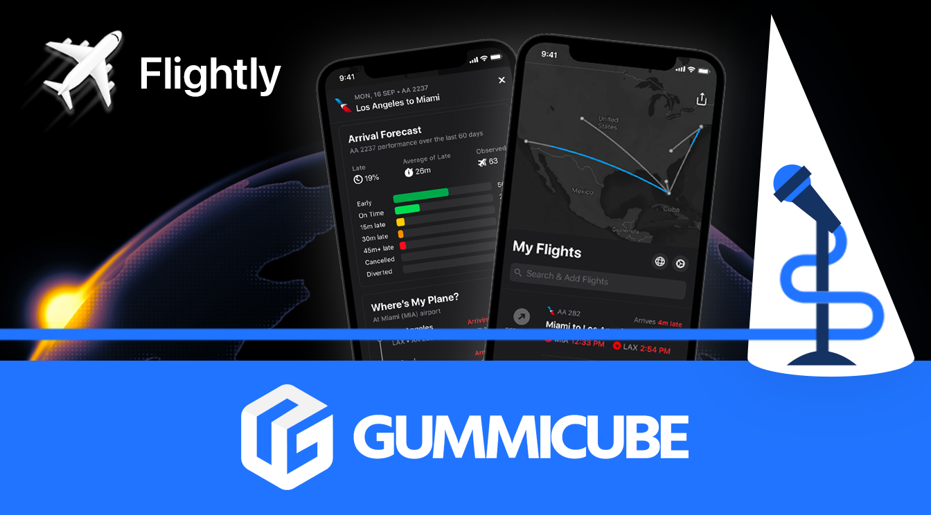
Ready for your next vacation? Flighty’s here to ensure travelers never miss a flight update with accurate data to monitor their travel itinerary. Packed with comprehensive features that let users track everything from their seat number, baggage status, and delays. It has also been featured on the App Store’s Today tab, earning an Apple Editor’s Choice Award in the process.
However, at Gummicube we know that developing a great product is just part of succeeding in the App Store. An effective app marketing plan will help continuously drive attention and conversions to your app outside of word-of-mouth. In today’s App Store Spotlight, we’ll take a look at how the developers at Flighty have applied several ASO best practices to help skyrocket their app’s success.
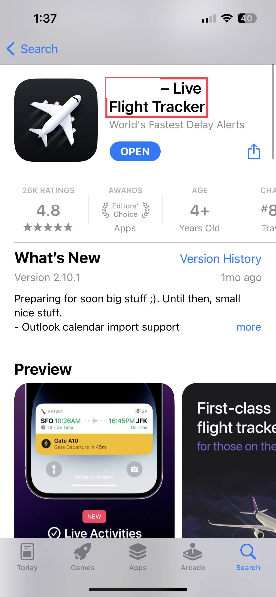
As the first element users come across in your app listing, the app icon should ideally strike a balance between standing out and indicating what your app is about. Taking a look at Flighty’s app listing we can observe how the developers understand this when selecting their icon.

Not only is Flighty’s icon identical to its logo, keeping a consistent brand identity, but it also incorporates symbolism that clearly hints at what the app’s features relate to. Effective app icon optimization consists of catching user attention while providing insight into the app’s core functionality.
An app title is the first text element appearing in search results and should accurately represent your app and its core features. Developers can establish their app title by seeing it as two parts that work cohesively to inform users and improve visibility.
Your app name is the part of your app title that stays consistent throughout all your distribution channels. This is what users will identify at first glance and should always align with your overall brand regardless of any changes happening with the rest of your marketing plan. Adopting this strategy maintains a consistent brand identity and helps users already familiar with your service identify it right away.

Your app title doesn’t only have to include your app name – it can also support your keyword rankings through carefully selected title tags. Ideally, your app’s title tags will consist of hyper-relevant terms that align with your app's core features. These keywords will be some of the most important in your app metadata and should include terms that users are prominently searching for.

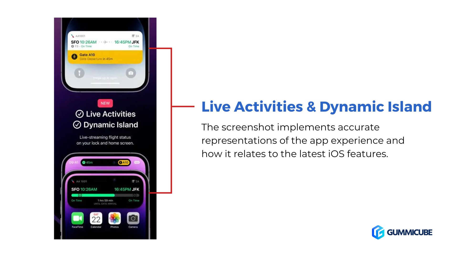
There are several ASO best practices that can be observed in Flighty’s app screenshot strategy. A developer will want to highlight their app’s value proposition in a way that’s visually engaging for the user while leveraging the latest market tools to do so. Taking a look at Flighty’s current screenshots, each image combines key feature information with app screenshot design best practices to create an effective image that can help increase conversions.


An app description is one of the most important conversion tools in an App Store listing. It provides valuable space to communicate all the benefits your app provides and secure a download if optimized. A good strategy is to identify your app’s core features and explain each one in detail, structuring the copy so that it balances readability and important app information.
Flighty’s description takes this approach by dividing each value proposition into different sections, each one mentioning a key feature found within the app.

Separating app info into short bursts of information creates an easier reading experience for users, avoiding big blocks of text that can dissuade them from learning more. However, optimal description structure should be combined with other ASO best practices to help create an effective app description.
At the time of writing, the majority of the Flighty description is organized through bullet points. While this provides a simple format for users to read and skim through, the publishers can improve upon it by including more information alongside each feature to make the copy more engaging. Relating each feature back to a user's need is an effective approach to supporting the app functionalities listed while also calling out what a user is looking for.
Flighty is a prime example of an app whose developers know how to combine a great app experience with effective ASO strategies. By strategically optimizing several elements in their app listing, Flighty has been able to rank within the top 10 for relevant terms such as “flight tracking”, “flight tracker”, “and “track flight”. But can they keep their momentum in time for summer?
Do you need help optimizing your travel app listing? Get in touch with the ASO experts at Gummicube today!

Discover how Orbit can boost visibility and conversions with smarter keywords, optimized creatives, and a stronger App Store presence.

Explore how Home Contents can improve its App Store listing with smarter ASO tactics, from stronger keywords to better screenshots and video strategy.

Discover how onX Offroad can enhance its App Store presence with smarter ASO strategies, from metadata tweaks to creative optimizations.