
App Store Spotlight: Orbit - Time-Based Invoicing
Posted on April 17th, 2025
Discover how Orbit can boost visibility and conversions with smarter keywords, optimized creatives, and a stronger App Store presence.
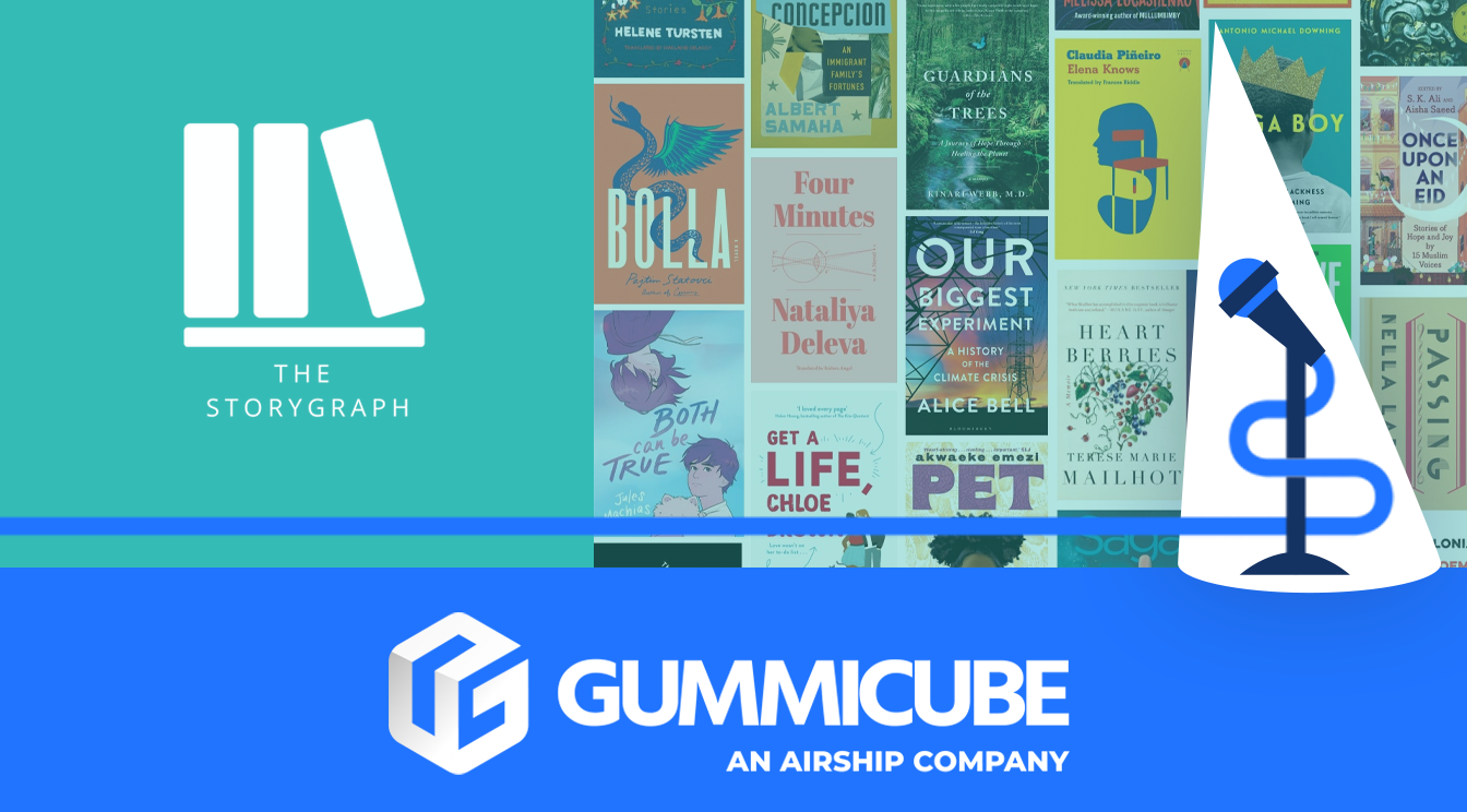

In the world of book tracking apps, StoryGraph has emerged as a strong contender, offering a comprehensive reading tracker with in-depth statistics and personalized book recommendations. With the increasing popularity of digital reading tools, apps like StoryGraph provide a valuable solution for readers looking to better manage their reading habits. But standing out in the competitive app marketplace requires more than just great app functionality—it requires regular updates and a well-optimized App Store presence.
StoryGraph’s title and subtitle work well to set user expectations, but there are still areas for improvement, particularly in its creative elements. A strong ASO (App Store Optimization) strategy includes intentional use of high volume keywords, compelling visuals, and effective engagement techniques to help potentially increase downloads and user retention. In this week’s App Spotlight, we’ll analyze StoryGraph’s App Store presence, comparing it to a key competitor, Bookly - TBR Book Tracker, to highlight opportunities for further optimization and growth.
StoryGraph’s title, “StoryGraph: Reading Tracker”, is a great example of a straightforward and effective app name. It immediately communicates the app’s purpose, ensuring that users searching for a reading tracker will know they are in the right place. This level of clarity helps with both user engagement and searchability, making it easier for potential users to find the app organically.
The subtitle, “Book recommendations and stats”, further enhances the app’s discoverability by emphasizing its key functionalities. Users can instantly understand that StoryGraph provides more than just tracking—it offers personalized recommendations and data-driven insights into their reading habits. While this subtitle is already strong, incorporating additional high-search keywords such as “TBR” (to be read) or “reading manager” could help increase StoryGraph’s visibility in search results amongst a highly relevant demographic.
Another potential area for optimization is within keyword testing. StoryGraph’s target audience may respond differently to new or more specific keywords. Running A/B tests with different subtitle structures could provide valuable insights into which keywords resonate best with StoryGraph’s target audience. Being intentional with new keyword inclusion within the title and subtitle of their app could help improve both search rankings and user conversion rates, leading to higher installs and long-term engagement.
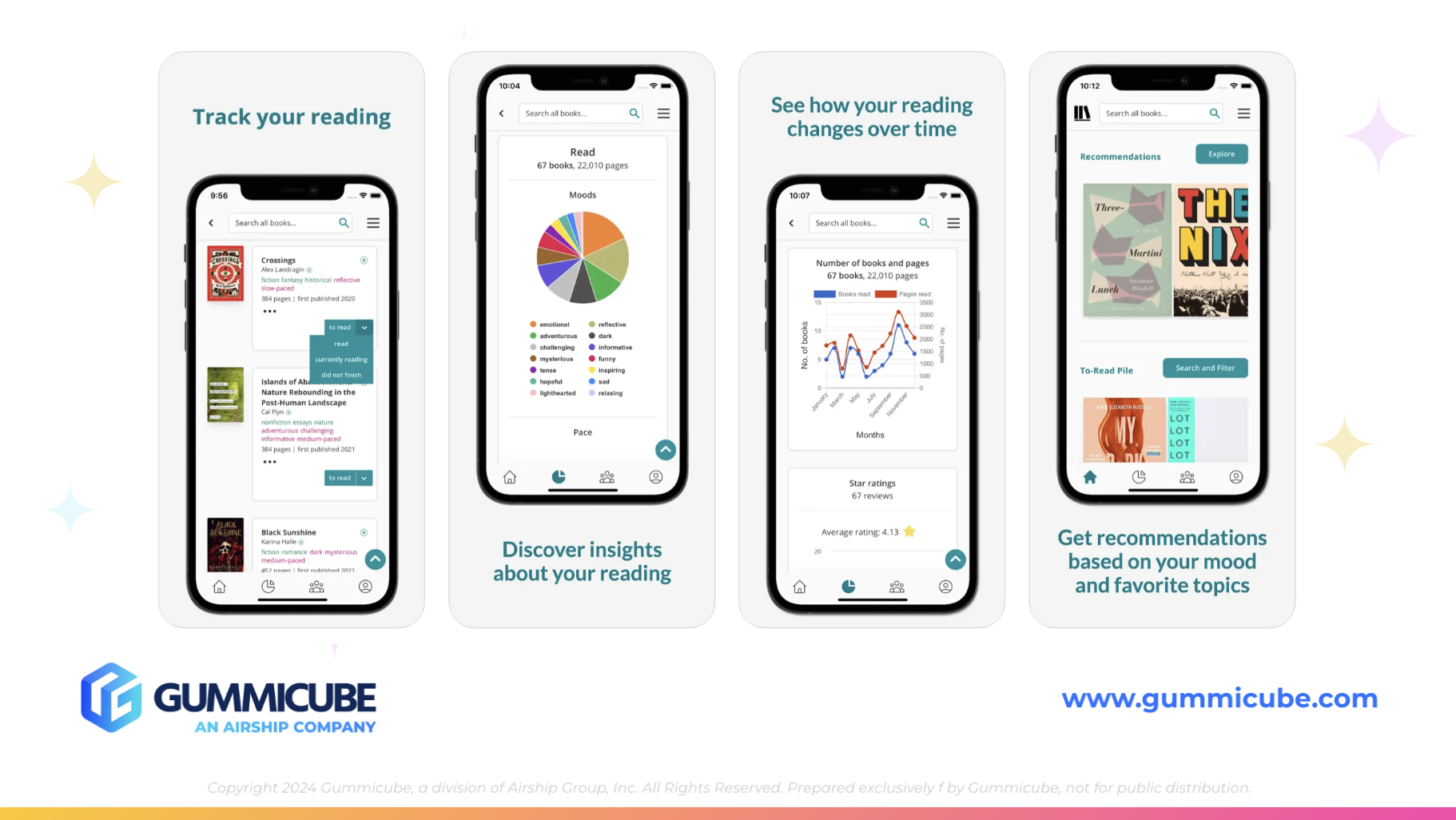
While StoryGraph effectively conveys its value through its title and subtitle, its creative elements—particularly screenshots—leave room for further optimization. Currently, StoryGraph utilizes 8 out of the 10 available screenshots, leaving two additional opportunities to enhance keyword exposure and visually engage potential users. Screenshots are one of the most impactful factors influencing downloads, so maximizing this real estate is crucial.
One key area for improvement is their visual impact. StoryGraph’s current creatives are neutral, which can be beneficial for a clean, minimalist aesthetic but may not capture attention as effectively as competitors’ visuals. Their use of iPhone mockups is a good foundation, but there are several ways to refine their approach:
A/B testing different variations of these designs and new keyword elements could help determine which styles drive higher engagement and retention rates for their specific audience of book lovers. Utilizing short, impactful copy within screenshots can further entice users by clearly showcasing the app’s benefits.
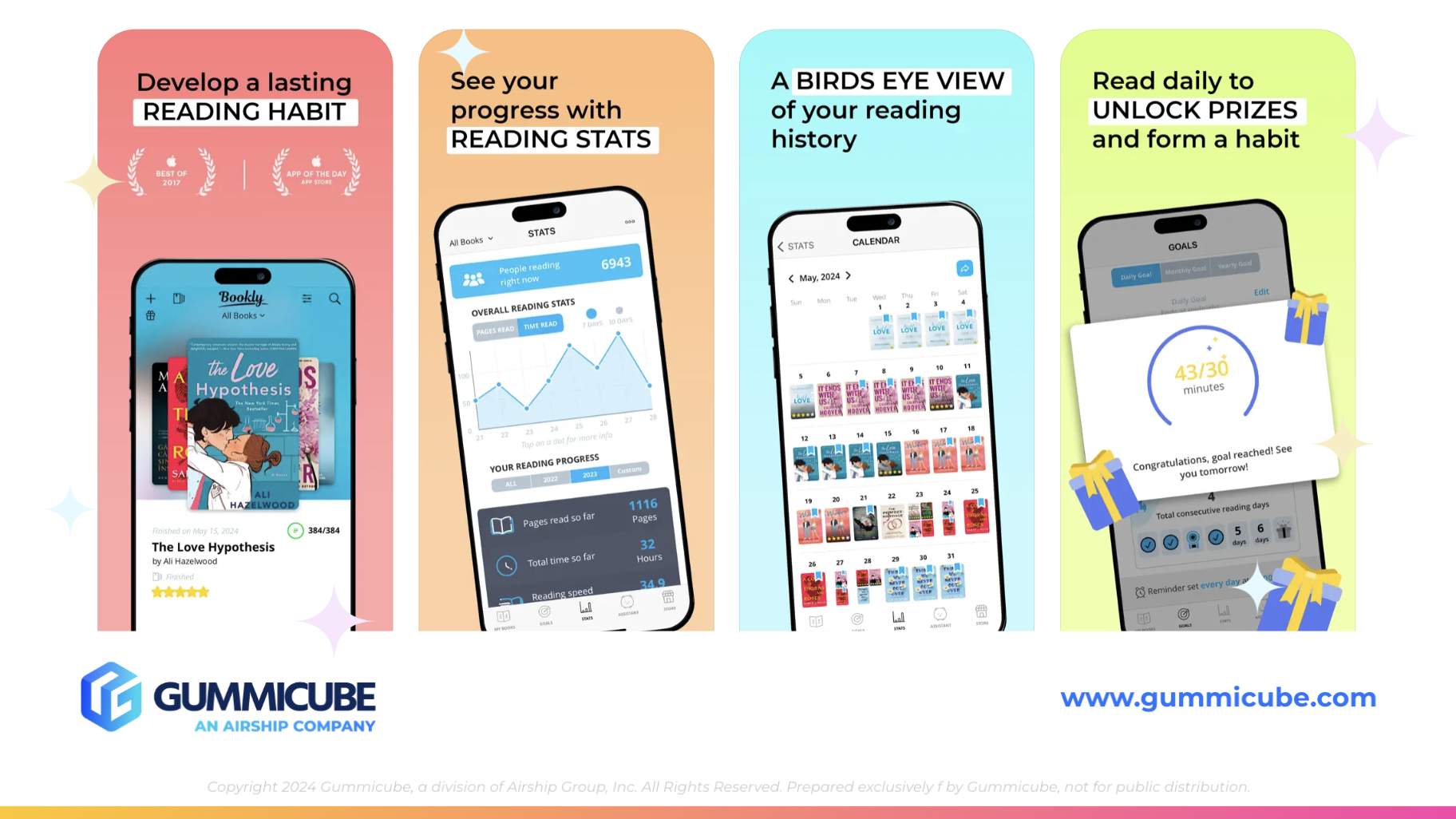
To better understand how StoryGraph can refine its creative strategy, it’s useful to compare it with a close competitor—Bookly - TBR Book Tracker. Bookly’s subtitle, “Bookshelf and reading manager”, provides an alternative take on positioning, with the inclusion of “TBR” being particularly notable. This acronym is widely recognized within the book community and could help StoryGraph improve its keyword strategy and search results within the Apple App Store itself.
In terms of creatives, Bookly’s screenshots are more visually engaging. They incorporate bright colors and varying designs that make each screenshot feel distinct. Some standout features of Bookly’s approach include:
These elements potentially contribute to higher engagement and conversion rates. By adopting similar creative strategies, StoryGraph could better capture user interest, encourage installs, and improve overall App Store performance. Regularly A/B testing and refining screenshots, incorporating more visually striking backgrounds, and leveraging engaging design elements could make a substantial difference in attracting new users.
StoryGraph has done an excellent job with its title and subtitle, ensuring clear communication of its core functionalities. However, its screenshots and overall visual presentation could benefit from further refinement. By leveraging all available screenshot slots, experimenting with brighter colors, varied text styling, and close-up feature highlights, StoryGraph could significantly enhance its appeal and potentially increase conversion rates.
By analyzing competitors like Bookly, StoryGraph can adopt strategies that have proven effective in capturing user attention and driving downloads. Small adjustments to creative elements can make a big difference in standing out in the highly competitive book tracking app space. Exploring A/B testing for different subtitles, optimizing metadata, and considering the addition of a preview video could further strengthen StoryGraph’s overall App Store presence.
Optimizing an app store listing is an ongoing process, and even well-established apps like StoryGraph can benefit from A/B testing and regular, strategic refinements. Every app has opportunities for growth, and understanding user behavior through data-driven insights can be the key to unlocking higher visibility and conversions.
If you're looking to elevate your app’s visibility and conversion rates, Gummicube’s team of ASO experts can help. We specialize in customized ASO strategies that align with your app’s unique strengths and target audience. Let’s discuss how data-driven ASO strategies can take your app to the next level!
Discover how Orbit can boost visibility and conversions with smarter keywords, optimized creatives, and a stronger App Store presence.

Explore how Home Contents can improve its App Store listing with smarter ASO tactics, from stronger keywords to better screenshots and video strategy.

Discover how onX Offroad can enhance its App Store presence with smarter ASO strategies, from metadata tweaks to creative optimizations.