App Store Spotlight: Orbit - Time-Based Invoicing
Posted on April 17th, 2025
Discover how Orbit can boost visibility and conversions with smarter keywords, optimized creatives, and a stronger App Store presence.

In the crowded world of fitness apps, standing out isn’t just about delivering great workouts—it’s about creating a powerful, polished App Store presence that captivates potential users. Crunch Fitness is a household name in the fitness industry, renowned for its welcoming gym atmosphere and vibrant branding. However, does the Crunch Fitness iOS app pack the same punch?
For this week’s Spotlight blog, we’ll dive deep into Crunch Fitness’ App Store strategy, exploring its title, visual assets, and overall optimization efforts. From the strengths of its branding to opportunities for improvement, we’ll analyze what’s working—and what’s not—when it comes to driving downloads.
Whether you’re a fitness brand looking to optimize your app or simply curious about what makes a standout App Store listing, this spotlight will break down key elements that drive success. Let’s start with the cornerstone of any app’s presence: its title and subtitle.
First impressions matter, especially on the App Store, where users often make split-second decisions about whether to download an app. For Crunch Fitness, the app title, “Crunch Fitness,” is short, memorable, and on-brand. However, it doesn’t take full advantage of App Store Optimization (ASO) opportunities.
A well-optimized title does more than state a brand name—it works as a keyword strategy to boost discoverability and hint at what the app offers. Unfortunately, Crunch Fitness misses an opportunity to target relevant keywords like “workouts,” “health and fitness app,” or “training classes.”
Even more concerning is the lack of a subtitle. Subtitles provide 30 characters of prime real estate to showcase the app’s unique features or benefits. Without one, Crunch Fitness forfeits a critical chance to appeal directly to users and rank for additional keywords. A subtitle like “Your Gym Companion” or “Health and Fitness App” could instantly communicate value while improving visibility in searches.
Improving Crunch Fitness’ ASO efforts starts with optimizing its title and adding a descriptive subtitle. Currently, the app’s title is simply “Crunch Fitness,” and it lacks a subtitle altogether. Fully utilizing the character limit for both the title and subtitle provides more opportunities to integrate valuable keywords, which can improve the app’s visibility in search results. For instance:
These small changes would not only increase keyword coverage but also make the app feel more relevant and user-focused. With so much competition in the fitness category, standing out in search results is critical—and the title and subtitle are the first steps toward achieving that.
When users land on an app’s listing, they aren’t just reading—they’re scanning. Screenshots and preview videos serve as visual proof of an app’s value and play a major role in driving conversions. For fitness apps, this is particularly important; users want to feel inspired and see how the app fits into their lifestyle.
Crunch Fitness has laid a solid foundation for its visuals, with on-brand orange gradients and bold, clear text that highlights key features. These elements create a sense of cohesion and professionalism, which is essential for building trust. However, the visuals stop short of being truly engaging.
The app currently lacks a preview video, which is one of the most compelling tools for grabbing attention. Preview videos allow apps to show, not just tell, what they offer. Without one, Crunch Fitness misses the chance to demonstrate features like class scheduling or workout tracking in action.
While the screenshots are consistent, they feel static. The use of plain iPhone mockups and repetitive designs, while following the best practice of a straight-on frame for clarity, fails to make the visuals action-oriented or engaging. Without elements that zoom in on key UI features or highlight app functionality, the screenshots lack the energy and excitement users expect from a fitness app, resulting in a disconnect between the brand's vibrant personality and its App Store visuals.
Visuals should tell a story, guiding users through the app’s key features in a way that feels dynamic and engaging. For Crunch Fitness, this means:
With these changes, Crunch Fitness can create a more compelling visual narrative that captures the excitement of fitness and motivates users to download.
A successful App Store listing combines creativity with strategy. For Crunch Fitness, refining its visuals is a powerful way to better communicate its value and stand out from the competition.
Adding a preview video is the most impactful step Crunch Fitness can take. Videos are proven to boost conversion rates, and for a fitness app, they offer a chance to highlight features like interactive workout plans and personalized recommendations. This could bring the brand’s vibrant personality to life in a way static visuals cannot.
In addition to a video, refreshing the screenshot designs is key. The current orange gradients are visually appealing but could benefit from a touch of variety. Alternating between different layouts, such as testimonials or progress tracking visuals, can keep users engaged and demonstrate the app’s versatility.
Adding a strong call-to-action in the final screenshot could help convert hesitant users into loyal subscribers. These changes may seem small, but in the highly competitive fitness category, they can make all the difference.

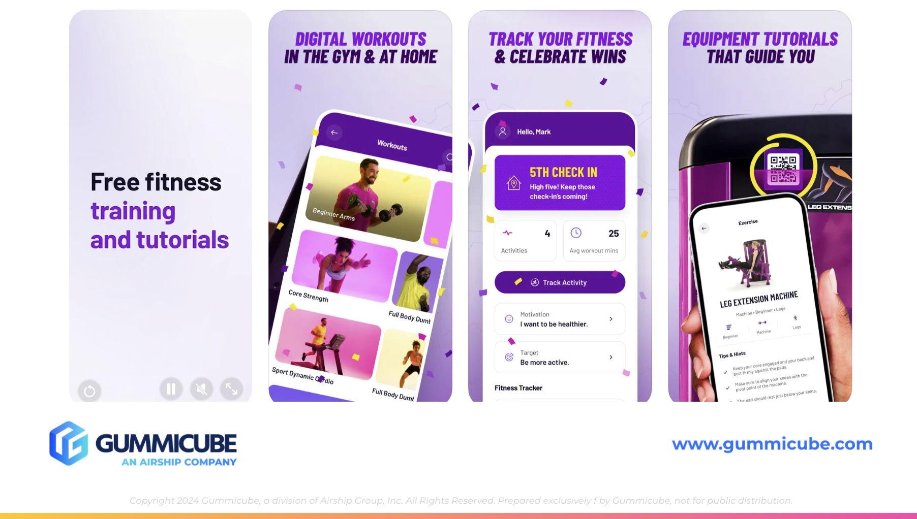
While Crunch Fitness has plenty of strengths, it faces tough competition in the fitness app space. One of its main competitors, Planet Fitness, offers a strong example of how to craft an engaging App Store presence.
Planet Fitness uses a descriptive title, “Planet Fitness Workouts,” which immediately signals what the app offers. Its subtitle, “Workouts for Everyone,” is inclusive and appealing, making the app feel accessible to a broad audience.
The visual elements of Planet Fitness’ listing are equally impressive. A high-quality preview video grabs attention and showcases key features in an engaging way. The screenshots are dynamic, with designs that change from slide to slide, maintaining user interest while clearly highlighting the app’s capabilities.
By comparison, Crunch Fitness falls short in a few key areas. Adding a subtitle, incorporating a preview video, and diversifying screenshot designs would help level the playing field and position Crunch Fitness as a top-tier option for fitness enthusiasts.
Crunch Fitness has all the tools to succeed, but its App Store listing doesn’t fully reflect the app’s potential. By refining its title and subtitle, enhancing its visual assets, and taking cues from competitors, Crunch Fitness can turn its App Store presence into a powerhouse.
The fitness category is one of the most competitive on the App Store, but with strategic updates, Crunch Fitness can attract more downloads and build a stronger connection with its audience. Success isn’t just about having a great app—it’s about ensuring users can see that greatness at first glance.
Your app deserves to stand out, and we’re here to help make that happen. Whether you’re looking to optimize your title, refresh your visuals, or explore advanced ASO strategies, Gummicube has the expertise you need.
For those looking to elevate their ASO strategy, innovative solutions like data-driven testing can make a significant difference in driving app visibility and downloads. Curious about how we can help? Let’s chat and explore the possibilities for your app’s ASO success.

Discover how Orbit can boost visibility and conversions with smarter keywords, optimized creatives, and a stronger App Store presence.

Explore how Home Contents can improve its App Store listing with smarter ASO tactics, from stronger keywords to better screenshots and video strategy.

Discover how onX Offroad can enhance its App Store presence with smarter ASO strategies, from metadata tweaks to creative optimizations.