How to Write an Apple App Store Description
Posted on July 17th, 2024
Learn how to approach App Store descriptions the right way so you can effectively engage and convert users.

UPDATE: Google Play Screenshot best practices have changed over the years. Read our updated post in the Google Play Screenshot best practices for 2020. Those following along with our other posts on Google Play app store optimization will know that many elements of an app listing, the metadata like the Google Play app name and descriptions, are directed by which features are most sought after and differentiate an app. 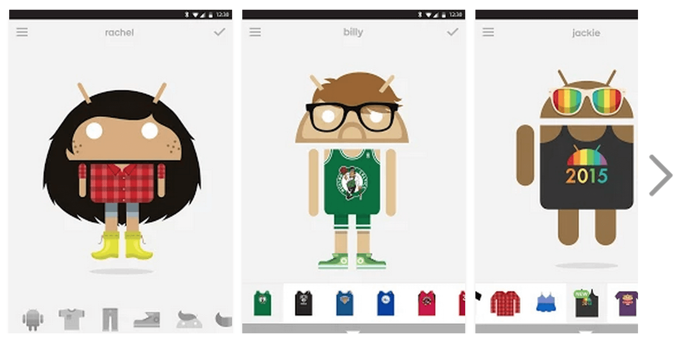 Creating an app listing that targets specific searches from a specific audience even impacts creative elements including app icon design and Google Play screenshots.
This theme of focusing on the most in-demand features continues in Google Play screenshot design. Screenshots play a large role in converting app listing views to users. Note that screenshots are featured prominently, without scrolling down (known as "above the fold") on Google Play. 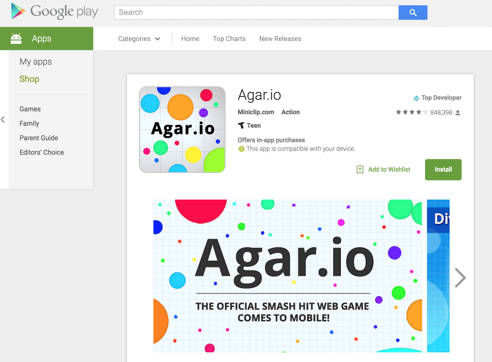 Potential users (the app's target audience) are searching the app store using keywords and phrases unique to mobile app store search. An optimized app title, description and short description will help get an app indexed for relevant search terms, and the app's icon and screenshots will help convert the searcher to a user. It is important, then, to highlight
features in the app that a target audience is searching for.
Screenshots do what the icon and descriptions can't. They provide a way to show a potential user what an app does and what its best features are, instead of telling them. Show them what they care about first. The market is who defines what the most searched for features are, and how they refer to these features. Is the target market using "photo collage" or "photo blender"? As expected, there are search terms that maintain a high level of interest, and terms that gain popularity. The app store is dynamic, and adjusting screenshots to meet the current demands of the market can pay dividends. We see significant trends at least seasonally, and often monthly in various categories and app types.
Similar to creating screenshots that highlight in-demand features, support of specific devices is a feature that must be communicated. The way to communicate support for a device size or type is by including screenshots in the format of the device.  Google Play makes this easy, allowing you to add up to 8
screenshots for each type of device you support, from 7" and 10" tablets to Android TV and Android Wear.
Google requires 2 screenshots for each supported device except Android Wear - which only requires one - and allows up to 8. Use all 8 for every device supported. Additionally, there are some requirements around size and format to be aware of. Screenshots must be in JPEG or 24-bit PNG format. Their minimum dimensions are 320px and their maximum is 3840px, and the maximum dimension of your screenshot can't be over twice as long as the minimum dimension. Similarly, Google recommends some best practices when uploading Android Wear screenshots. It's commonly considered best to upload images with similar dimensions to your regular screenshots, and include images featuring both square and round devices. They also advise including a screenshot of your app running on an Android Wear device. Aside from the technical requirements, the restrictions on design are unlimited! Publishers can choose to use text to explain a feature:  Or can show how the app can be used:
 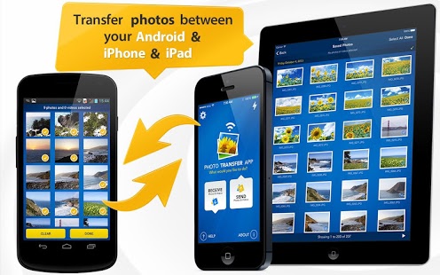 Or include reviews, awards, or whatever best position the app for conversion. For more information from Google on screenshots can be found here.

Learn how to approach App Store descriptions the right way so you can effectively engage and convert users.

Learn how to grab your audience's attention through effective and engaging app store preview videos.

Welcome to this week’s ASO Weekly - The App Store halts gambling ads amidst outcry and the Apple takes a bite out of NFT app sales.