
Unleashing Success: ASO Breakdown of Pupford's Puppy Training App
Posted on April 24th, 2025
A deep dive into Pupford’s App Store listing, with tips to improve visibility, boost conversions, and turn more browsers into loyal users.
App Store Screenshots need to do more than show screencaps from an app – they need to convey features and establish a voice for the app. Developers must consider several factors, such as color choice, font for the screenshot copy and how the screenshots look when viewed in Dark Mode.
To see this in action, let’s shine a spotlight on Loóna, a nighttime rest and relaxation app currently featured as Apple’s App of the Day. How does it use its screenshots to establish branding and voice, and does the nighttime app remain effectively optimized in Dark Mode?
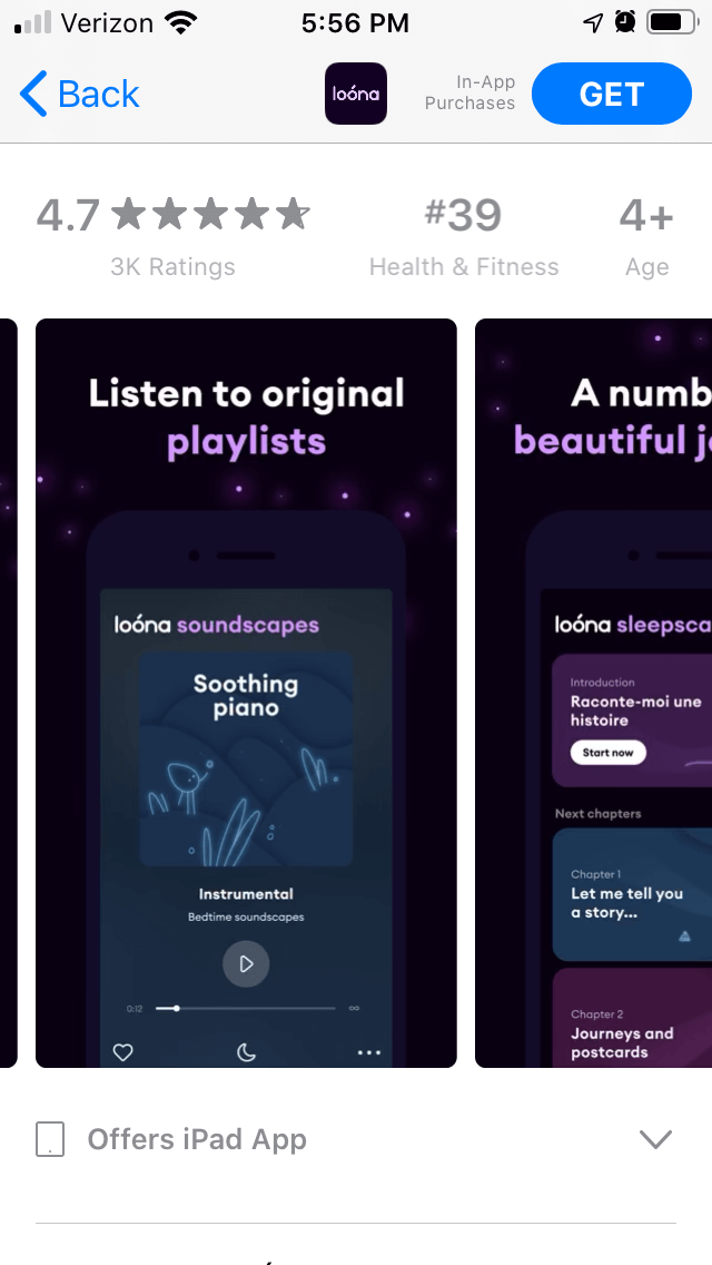
First, we need to examine the screenshots as a whole. Loóna uses five screenshots on both the Apple App Store and Google Play Store, and while they are very similar, there are a few differences.

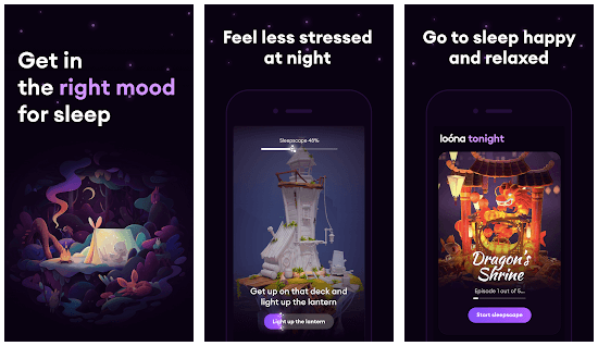
The first three screenshots call out the core value propositions – get in the right mood for sleep, feel less stressed and go to sleep happy. They use different in-app imagery, such as various stories and mini-games, but they convey the same purpose.
The last two screenshots provide distinct value propositions. The App Store screenshots call out original playlists, while the Google Play ones talk about calming music and stories. Both include a screenshot for “beautiful journeys,” but they use varying imagery, and the Google Play one calls out a specific number.
While it is possible to use different value propositions on both stores based on what users respond well to, Loóna has room for more screenshots on both store listings. It could easily include all the value propositions on each store without hitting the maximum of eight Google Play screenshots or ten Apple App Store screenshots.
What tone do the screenshots convey? Color usage can play a major role in creating the mood and messaging of the screenshots.
In the case of Loóna, the app uses dark colors and shades of purple, with the occasional blue. The font for the screenshot copy matches the in-app text, using white text while emphasizing certain words in a light purple.
Both the handset in the screenshots and the background are a night black, with little white spots representing starlight near the top of each image. The handset’s border is a very thin purple, which makes it difficult to see against the black background.
The in-app imagery uses similar nighttime colors, with the occasional fiery red and orange from the app itself. The color choice is designed to invoke thoughts of camping, the night and sleep – as is appropriate for an app designed to help users wind down at night.
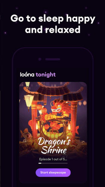
At the same time, the use of dark backgrounds and handsets make the two blend together and hard to differentiate. A stronger contrast between the handset and background may help the screenshots stand out more. However, there is a balance to be found between the contrast and the mood the screenshots are trying to evoke.
Loóna is an app designed for use at night, which means there is a high likelihood that users will find the app while their phones are in Dark Mode. That being the case, we need to see how the screenshots look when viewed that way.
When viewed in light mode, the dark screenshots stand out against the white background of the screen. The visual effects from the screenshots remain, while still keeping them distinct from the other aspects of the listing.
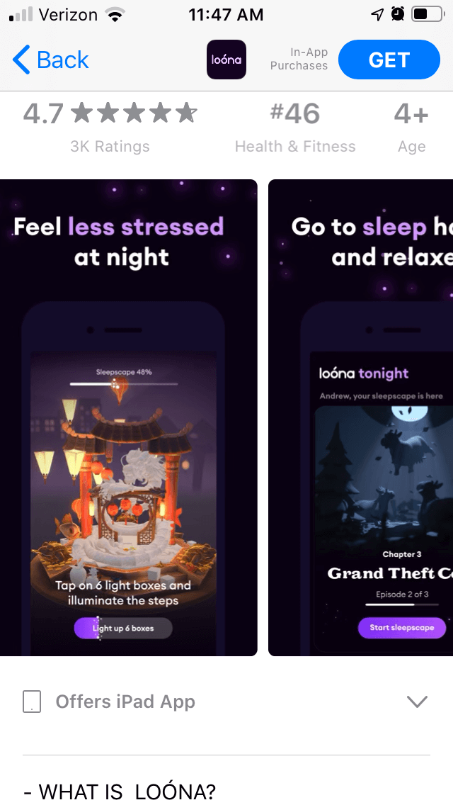
In dark mode, the darker colors don’t blend in completely with the background’s shades of gray, although they do clash a little.
The screenshots are still darker than the surrounding area, but the lighter imagery in the screenshots stands out more. Adding the thin purple background used for the handset could help frame the screenshots in Dark Mode without losing the motif.
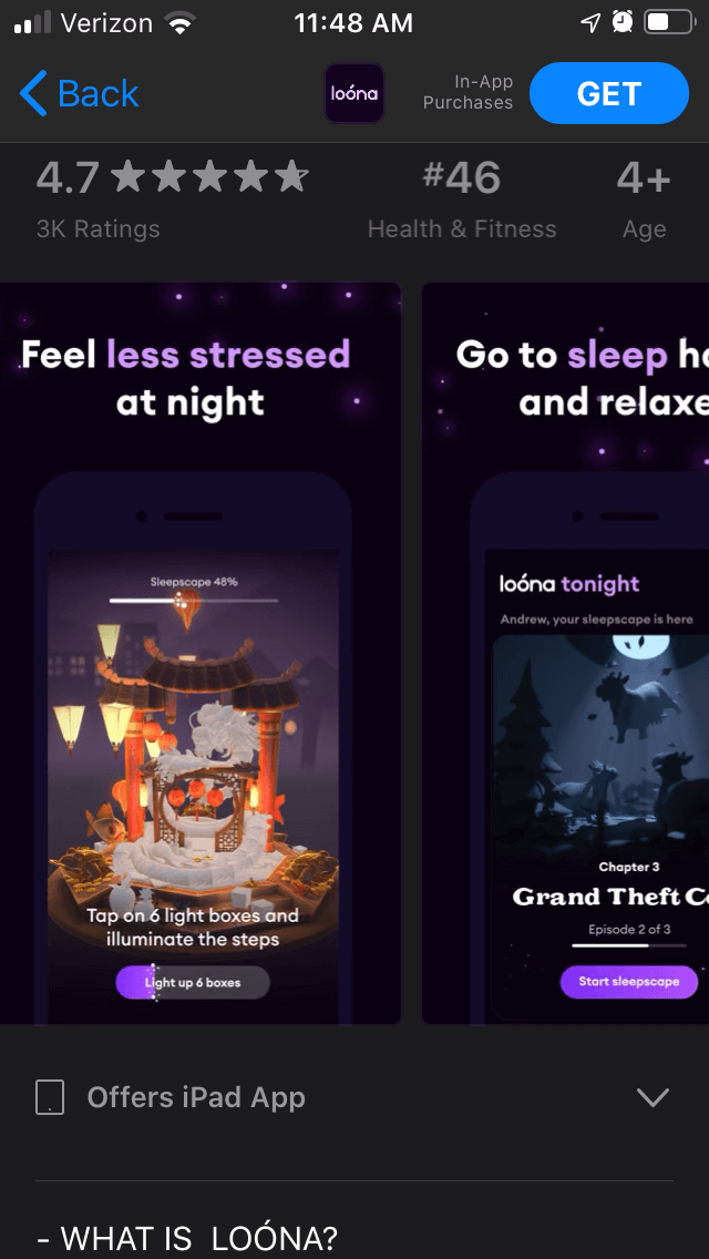
The effect on the font should also be noted. In Light Mode, the app listing details like the title and description use black text on a white background. In Dark Mode, the text becomes a light gray font.
Loóna uses white and purple font on its screenshot copy, so the copy font stands out more brightly than the title or description font when viewed in Dark Mode. That draws attention to the copy while making the outside text stand out less.
App Store Screenshots should use their designs to convey their values and establish a proper thematic branding. It’s important that the screenshots can deliver this whether the app listing is viewed in Light Mode or Dark Mode.
Loóna uses its dark color scheme to properly establish its branding as a nighttime app to help users unwind, although given its purpose, it’s especially important that it appeals to users when viewed at night.
Want to learn more about App Store Optimization? Contact Gummicube and we’ll help get your strategy started.

A deep dive into Pupford’s App Store listing, with tips to improve visibility, boost conversions, and turn more browsers into loyal users.

Discover how Orbit can boost visibility and conversions with smarter keywords, optimized creatives, and a stronger App Store presence.

Explore how Home Contents can improve its App Store listing with smarter ASO tactics, from stronger keywords to better screenshots and video strategy.