Unleashing Success: ASO Breakdown of Pupford's Puppy Training App
Posted on April 24th, 2025
A deep dive into Pupford’s App Store listing, with tips to improve visibility, boost conversions, and turn more browsers into loyal users.

With “Avengers: Endgame” breaking box office records, the hype for “Avengers” continues to grow. Anything with the Marvel name is aiming to capitalize on it,, such as the mobile game “MARVEL Contest of Champions.” While the game features Marvel characters battling for supremacy, is the app winning its own battle for keyword rankings in the App Store and Google Play Store? For this week’s App Store Spotlight, we take a look at Contest of Champions and see if its App Store Optimization is a marvel itself.
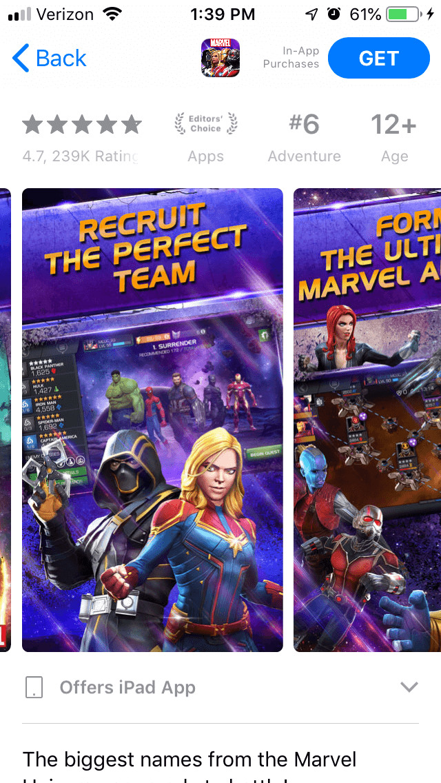
On the Apple App Store, Contest of Champions is ranked #6 in the Adventure category. It’s the top-ranked app under searches for “fun games,” “avenger” and several misspellings of “Avengers,” “free marvel games” and a multitude of other terms. It also ranks in the top three for “Marvel,” “Marvel superheroes,” “fighting games for kids” and several specific superheroes, such as “Spiderman” and “Thor.”
Its rankings get a bit lower for terms like “fighting games” (#20), “marvel unlimited” (#19) and “action adventure games” (#25). For the most part, it commands high rankings for a large number of keywords.
Creatives: Contest of Champions is played with the phone in landscape mode, but the screenshots are all presented in portrait mode. This allows it to show more than one at a time when it appears in search results. In order to make the image fit the portrait mode images, it takes the landscape-style screenshot and puts it between a large banner showing the callout text and images of the characters in the game.
The screenshots and characters are primarily characters from the “Infinity War” and “Endgame” movies, including Captain Marvel, Ant Man and Thanos. Even the character Hawkeye appears in an alternate outfit that more closely resembles his “Ronin” persona from “Endgame.” This helps the app capitalize on the excitement for the film, while showing fans searching the app store that it has their favorite movie characters. It’s essentially an update for seasonality – the creative sets are updated to focus on what characters are popular at the moment, just as an app might update its screenshots based on holidays and other events.

Each screenshot shows a different aspect of the game, including the variety of characters and the game in action. They’re accompanied by large, bold callout text like “Form the ultimate Marvel alliance” (which also references the “Marvel: Ultimate Alliance” games) and “Jump into the Marvel universe.” Yet the screenshots that show the fighting part of the game are saved for last; one of the screenshots shows what appears to be a map screen before we actually see what it looks like in action. Rearranging the screenshots to put the strongest ones first would be a useful move, as it would show off the key aspects of the game first and engage with more users at first glance..
The app also features a video. This also uses the format of a landscape video sandwiched between callout text and character pictures, but it shows much more of the game in action. While it does include popular “Avengers” characters, it also shows other fan favorites, such as Deadpool and Wolverine. It’s a short video, but it works well at showcasing the game in action and the variety of characters players can use. If it were to be in landscape mode, users would be able to see more of the gameplay without it being place between other things, but they wouldn’t see the video in searches. In portrait mode, it will show up in search results alongside two other screenshots.
Title & Subtitle: The app’s title, “MARVEL Contest of Champions,” takes up 27 of the 30 characters the App Store allows. Its subtitle, “Super Hero Fighting Game,” uses 24 and is filled with keywords that instantly tell users what the app is. This is a good use of the title and subtitle space, although the subtitle does still have space for six more characters.
Description: When the description begins, it uses a few paragraphs to talk about the mobile game. While the information is useful and written in an engaging manner, the format makes it hard to read on a mobile device’s screen.
If Contest of Champions were to split its blockier paragraphs into a few shorter lines, it would be much easier for users to read at a glance. This lets them better absorb the information before they get to the feature lists.
The feature lists themselves are very well done. The app uses multiple feature sets, each one focusing on a different aspect of the game and using bullet lists to quickly convey the relevant information. There are a few sections where the information could be split into more bullet points, such as when it starts listing several of the heroes or locations, but for the most part it presents the information nicely.
On the Google Play Store, Contest of Champions is ranked #19 in the Action category. It’s the first app under searches for “Marvel Game” and “Super Heroes Games” and the second-highest for “Marvel.” It in the top ten for a number of superhero related terms, including “Avengers” (#4), “Thanos” (#9) and “Daredevil” (#9).
Its rankings are a bit lower on Google Play than on iOS for several superheroes, like “Hulk” (#14) or “Iron Man” (#18). It also ranks #18 for “Marvel Comics,” #29 for “Free hero games” and #22 for “fighting game.”
Creatives: Contest of Champions begins with a video. This showcases the game in action, including characters from “Infinity War” and “Endgame.” Several of the poses and shots are similar to ones shown in promotional materials for the movies, drawing a connection between them for anyone who watches it.
Unlike the iOS version, the creative set is in landscape mode here, providing a closer look at the graphics and visuals. While it still uses the same screenshots and callout text as the iOS version on the screenshots, the characters are placed to the side. This way, the screenshots are not sandwiched between other images and the callout text and it’s clearer what’s happening in each one.
As with the iOS version, the screenshots do not actually show the fighting part of the game until the last two images. It could rearrange them to show off the most impressive aspects of the game first, starting off on a strong foot to engage users.
Description & Metadata: The description on Google Play is identical to the one on iOS. While the larger paragraphs are acceptable on the Google Play Store, although not on iOS, the description still needs to be formatted with the store’s algorithm in mind. This requires starting off each line and sentence with a keyword you want to target.
In the case of Contest of Champions, it does not do that often. While it does include superhero names for keywords, such as “Captain America” and “Hulk” (which it ranks #11 and #14 for), it also includes irrelevant keywords. This includes lines like “Embark on quests” (making it rank #164 for “embark”) and “The more powerful the Champion” (which helps it rank at #56 for “powerful heroes” and #38 for “powerful alliances”), which do little for targeting useful keywords.
While the bullet lists are still very useful for readability, Contest of Champions also needs to utilize those lists to target keywords. This will help improve its indexation for the terms it wants to rank for.
“MARVEL Contest of Champions” has done very well at ranking for a number of keywords and within its category. Even then, there are still areas where it can improve.
Its description does a fine job at telling users what the app is and what it can do, although it needs to be formatted better for each store. The use of bullet lists is great on iOS and Google Play, but the iOS description can be broken into shorter lines, while the Google Play one needs to focus on its keywords.
Marvel has also been advertising Contest of Champions in its comics and online, so fans of the franchise will know to look for it. While marketing in multiple channels is good, if it wants to improve its organic rankings and visibility, App Store Optimization is essential.
Want more information regarding App Store Optimization? Contact Gummicube and we’ll help get your strategy started.

A deep dive into Pupford’s App Store listing, with tips to improve visibility, boost conversions, and turn more browsers into loyal users.

Discover how Orbit can boost visibility and conversions with smarter keywords, optimized creatives, and a stronger App Store presence.

Explore how Home Contents can improve its App Store listing with smarter ASO tactics, from stronger keywords to better screenshots and video strategy.