
App Store Spotlight: Orbit - Time-Based Invoicing
Posted on April 17th, 2025
Discover how Orbit can boost visibility and conversions with smarter keywords, optimized creatives, and a stronger App Store presence.

Nordstrom has been a popular shopping destination for years and the Nordstrom Rack mobile app is another avenue for customers to shop for their favorite styles. While its flagship app was launched in 2011, Nordstrom’s discount-focused app has provided customers with bargain deals since its debut in 2014.
As mobile shopping ramps up for the holidays, developers will need to find ways to set themselves apart in the app stores through a streamlined buying experience and improved customer loyalty. But for a user to fill their cart in the first place, they must first discover and download the app. Being at the top of relevant search results is essential to improving the chances of success in the App Store.
In today’s App Store Spotlight, we’ll look at how Nordstrom Rack can improve its app product page through App Store Optimization best practices for increased visibility and downloads, both during the busy shopping season and beyond.
Metadata is the foundational element the app stores use when determining how an app should be positioned in search results. Ideally, on-page metadata like the Title, Subtitle, and Description, need to be optimized for both reach and conversions. The combination of engaging copy and well-planned keyword selection can be a powerful way to achieve long-term growth.
For Nordstrom’s developers, performing competitor research and analyzing its own current listing will be key in identifying areas of improvement.
Including keywords in an app subtitle is essential since it is heavily weighted during indexation and is one of the fields that appears in search results. Because of its importance in determining the position of an app, developers will want to include hyper-relevant terms here that are of a potentially high search volume. The field’s limited character count also further justifies the prioritization of only the most important terms.
Nordstrom Rack’s current Subtitle targets phrases that are relevant to the app. However, there is room for improvement. While “sales”, “clothes” and “shoes” are useful keywords, adding “& more” does not do much in the way of search visibility. Adjusting the Subtitle to include more valuable search terms that explain the app, such as “fashion” or “apparel”, can help with ranking visibility. That being said, this should be A/B tested to see its impact on conversions since the “& more” may drive users to convert once they do find the app and want to discover what that “& more” really is by downloading.
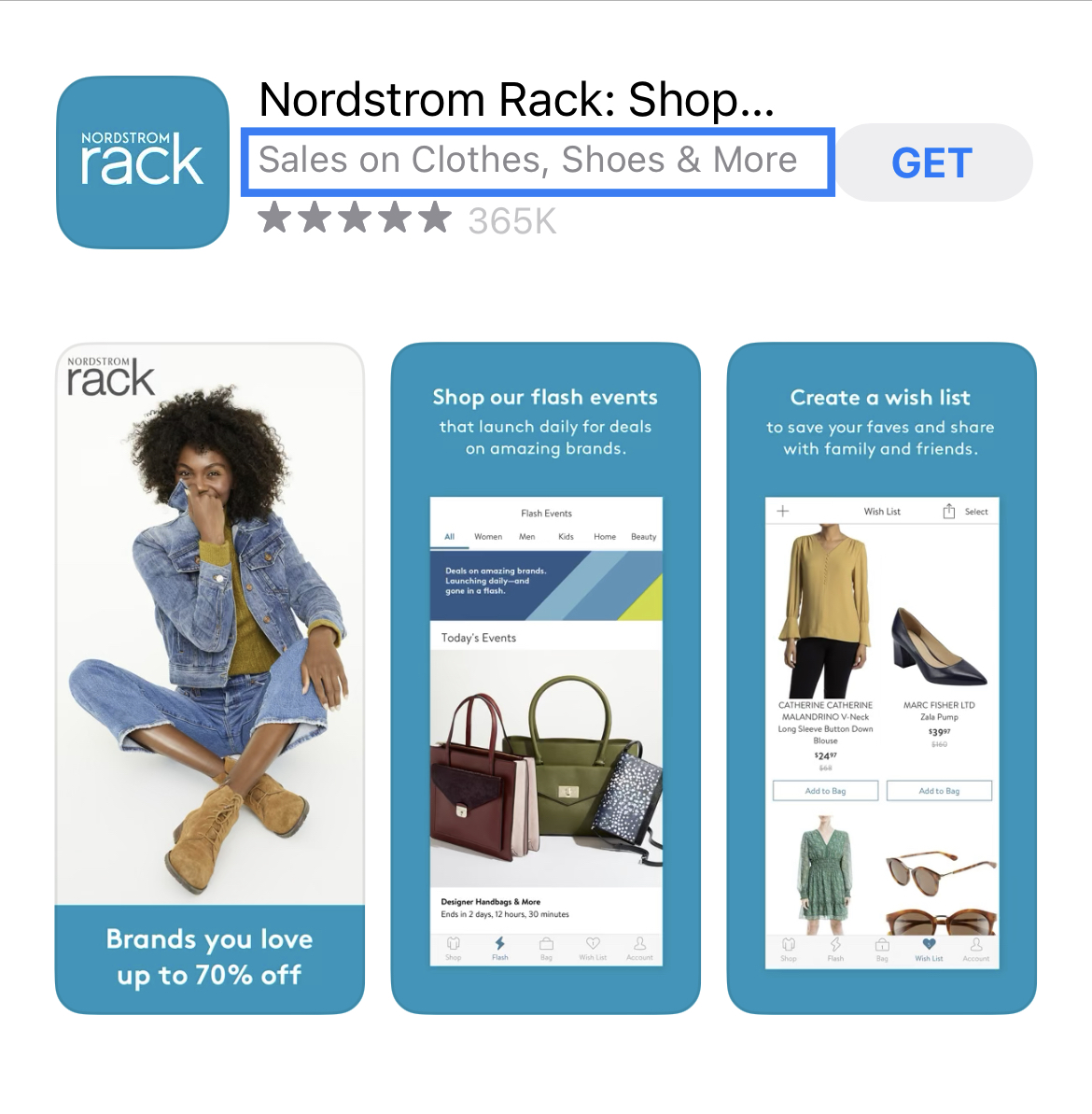
Nordstrom Rack’s developers can benefit from researching what keywords they are currently ranking for that can continue to improve the app position.
App Store descriptions are a great place to go in-depth about app features and unique value propositions. It’s recommended that developers structure their description in a way that organizes the different offers and functionalities of the app so that it’s easy to understand. They should detail each one in a way that provides enough information to help a user decide whether their app is the right choice.
This is something Nordstrom Rack’s developers should consider when editing their app description. Currently, their description briefly mentions the different features found within the app, but it can be improved by separating each value proposition and thoroughly explaining each one in an easily digestible way.
Organizing the description by short paragraphs that briefly detail essential features combined with CTAs and engaging copy is a recommended approach. Developers can even include keywords in their description. While they aren’t indexed for organic search, incorporating targeted terms can help with Apple Search Ads relevancy if they are running ASA campaigns.
Developers can also then follow up their short introductory paragraphs with feature lists. By separating different key app functionalities users can easily browse through the description and find what they deem most relevant to their needs. It also presents the app information in a way that’s quick and easy to read.
Some of Nordstrom Rack’s higher-ranking competitors implement this structure in their current description, giving credit to the idea that testing it may prove beneficial to improve readability and ultimately conversions for their own app.
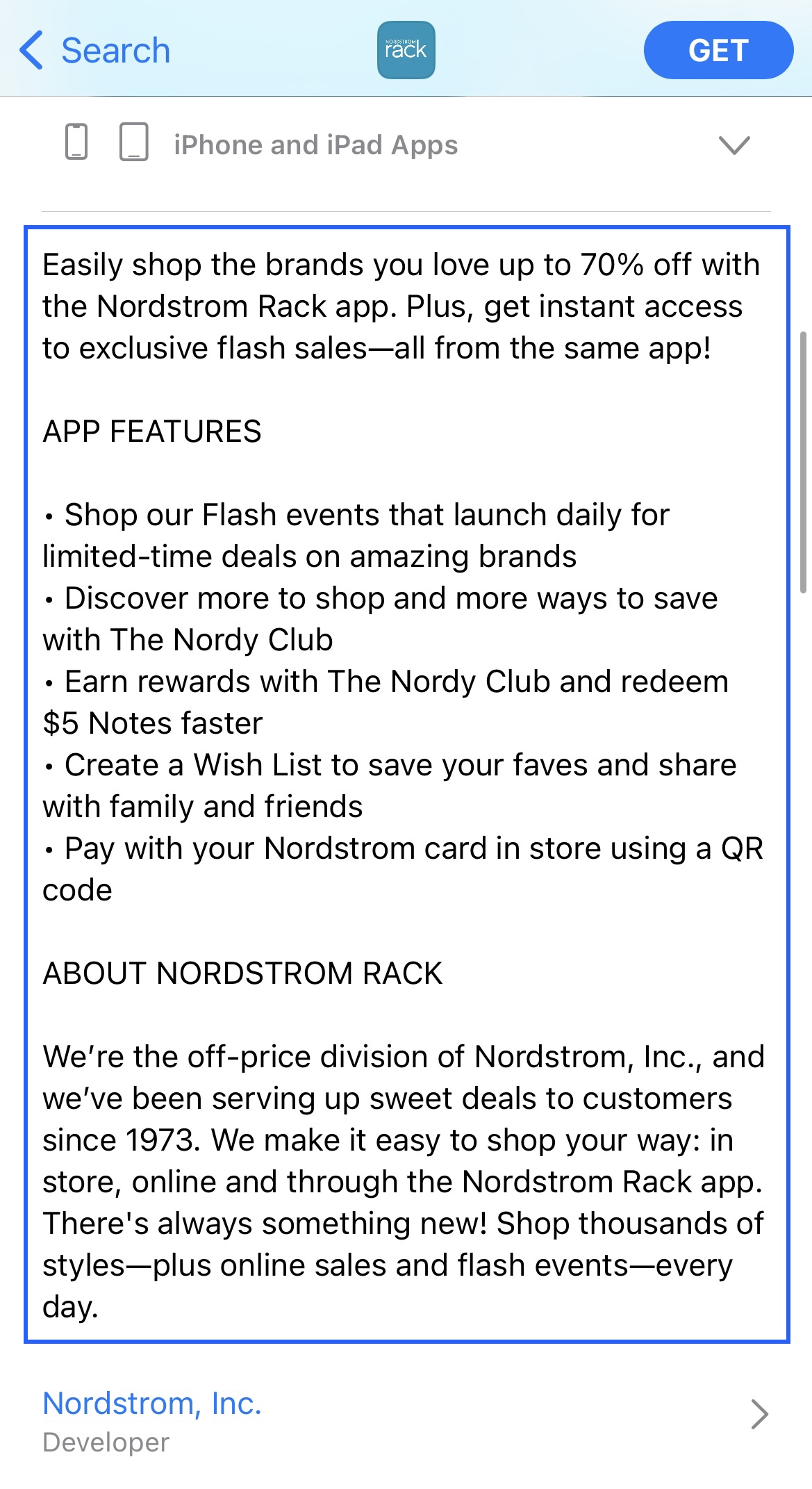

While short and to the point, the developers of Nordstrom Rack can restructure their description to include more in-depth information, keywords, and feature lists. This can be seen in Macy’s description.
Screenshots are powerful conversion tools that can provide a glimpse into the in-app experience while also highlighting relevant features at a brief glance. From handset images simulating the app in use, emphasized UI elements, and visible copy, there are several ways developers can make a screenshot experience visually engaging and informational for users, and each element should be A/B tested to see what works best.
While every user responds differently to the aesthetic composition of images, there are a few ASO screenshot best practices the developers can follow to improve how they communicate the value of their app through screenshots.
Using clearly distinctive text, whether through bold lettering, different colors, or larger font size is a good way of communicating the intended value proposition at first glance. Developers can also include a keyword as part of this standout text so users can easily relate their search query to the image being shown, leading to a higher potential for conversion on that keyword.
Another element to test is framing the UX inside of a device, showing how the app would look in use. While this is a small change, it is a common one among competitor apps in Nordstrom Rack’s category – even used by the flagship Nordstrom app.
Device frames can be a useful way to show the app is made for that user’s specific device, particularly recently with the introduction of Apple’s 6.7” screenshot dimensions. Users on iPhone 14 seeing this new screenshot device frame utilized, including the dynamic island, can instantly understand that the app is up-to-date without having to tap through to read release notes or device compatibility.
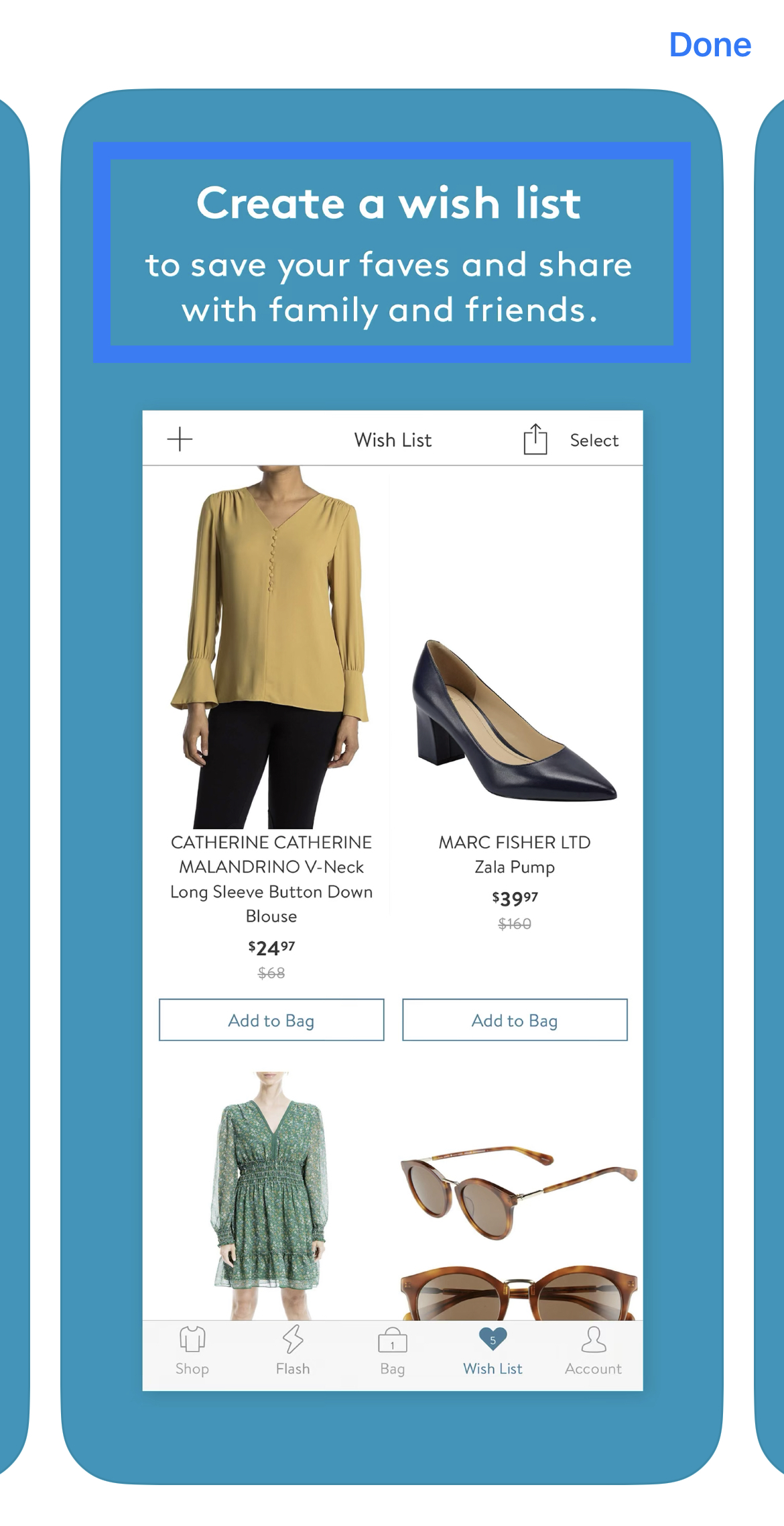


Making certain phrases stand out can capture a viewer’s attention immediately and handsets provide an accurate depiction of what the app consists of.
From a branding standpoint, Nordstrom Rack is differentiated from the flagship store app by emphasizing deals and discounts over luxury fashion.
With that in mind, there is currently a significant missed opportunity for Nordstrom Rack in emphasizing Black Friday and Holiday shopping in its metadata and/or screenshots.
Looking at some of the top-ranking apps for “apparel” and “shopping app”, Black Friday and Holiday promotions are abundant. This includes competitors like SHEIN, Fashion Nova, and Pretty Little Thing. Their use of seasonal promotional text is prominent in their creatives, from their icons to screenshots.
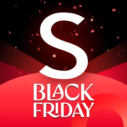

The icons for SHEIN, Fashion Nova, and Pretty Little Thing all take advantage of the seasonal popularity associated with Black Friday by incoporating relevant terminology.
Some apps have even implemented in-app events revolving Black Friday, making the user experience more engaging and unique right from search results. By creating in-app events, developers can capitalize on the trending popularity tied to a holiday or shopping season. A good example of an app that has in-app events in place for Black Friday and is also considerably high in search results is GOAT.

GOAT has leveraged the power of in-app events to create an engaging app listing experience for potential customers.
For an app that places so much emphasis on its great savings year-round, now is the most important time to stand out during the most competitive time of the year. Whether it’s through an in-app event or from the standard screenshot set, Nordstrom Rack needs to make sure potential new users know about its holiday shopping deals – otherwise they may be passed up for a competitor that does.
The developers at Nordstrom Rack have been able to create an app that provides users with great deals for the better part of the past decade. Being featured in the “Get the Best Deal” section of the App Store should also prove to be a welcome boost to visibility. However, modifications to their product page can be made to further improve their chances of succeeding in the long run as this feature doesn’t last forever and they’ll want to ensure continued growth, during their promotional period, during the holiday shopping season, and beyond.
Want to learn more about App Store Optimization? Contact Gummicube and we’ll help get your strategy started.

Discover how Orbit can boost visibility and conversions with smarter keywords, optimized creatives, and a stronger App Store presence.

Explore how Home Contents can improve its App Store listing with smarter ASO tactics, from stronger keywords to better screenshots and video strategy.

Discover how onX Offroad can enhance its App Store presence with smarter ASO strategies, from metadata tweaks to creative optimizations.