
App Store Spotlight: Orbit - Time-Based Invoicing
Posted on April 17th, 2025
Discover how Orbit can boost visibility and conversions with smarter keywords, optimized creatives, and a stronger App Store presence.
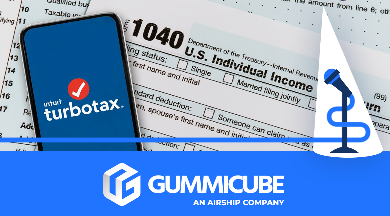

TurboTax: File Your Tax Return is one of the most well-known tax preparation apps on the market. As tax season approaches, millions of users turn to digital solutions like TurboTax to streamline the often-complicated filing process. However, in such a competitive space, simply being a popular brand isn’t enough—strong App Store Optimization (ASO) is crucial for maintaining visibility and driving downloads.
With tax preparation apps vying for attention, TurboTax must leverage ASO best practices to maintain its leading position. This analysis will explore how TurboTax utilizes ASO in its title, subtitle, and screenshots, as well as areas where improvements could further enhance its conversion rates.
A well-optimized title and subtitle are the foundation of any successful ASO strategy. They must be clear, keyword-rich, and directly relevant to what users are searching for.
TurboTax’s Title: TurboTax uses the title “TurboTax: File Your Tax Return,” which immediately conveys both the brand name and the app’s primary function. The inclusion of “File Your Tax Return” ensures relevancy in search queries related to tax filing, making it easier for users to find the app. Since tax season is a high-volume period, keyword-rich titles help capture organic traffic, boosting app store visibility.
TurboTax’s Subtitle: The subtitle, “E-file Taxes & Get Your Refund,” further reinforces the app’s core functionality and user benefits. The phrase “E-file Taxes” is particularly valuable, as it targets users specifically searching for digital tax filing solutions. Additionally, the mention of “Get Your Refund” highlights a key motivator for users—maximizing their returns in a hassle-free manner.
By effectively combining branding, keywords, and user benefits, TurboTax’s title and subtitle create a strong first impression.
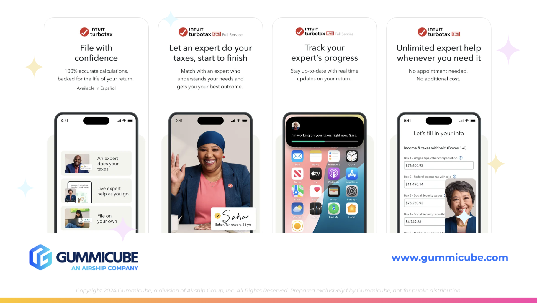
Screenshots are one of the most influential visual elements in an App Store listing. They serve as a quick-glance overview of the app’s functionality and benefits, often being the deciding factor for users considering a download. While TurboTax’s screenshots do contain relevant information, there are several areas where they fall short.
The primary issue with TurboTax’s screenshots is that they attempt to communicate too much at once. While informative, the heavy reliance on text makes them overwhelming for users who are quickly skimming through the page. Instead of digesting the key selling points, users may feel bombarded with information.
By streamlining the text and focusing on clear, visually appealing content, TurboTax can improve user engagement and drive higher conversions.
One of the most effective ways TurboTax could refine its ASO strategy is through A/B testing. A/B testing allows developers to experiment with different screenshot designs, text variations, and overall creative assets to determine which combination drives the highest engagement and conversion rates.
By testing different screenshot layouts, designs, or including specific keywords, TurboTax could identify the most effective way to appeal to new users. For example, they could compare a version with large, bold text highlighting key benefits against one with a more visually immersive, text-light approach. Testing variations in color schemes, call-to-action phrasing, and feature emphasis could reveal what resonates most with potential users.
With tax season being a highly competitive period for downloads in their app category, implementing A/B testing strategies would provide TurboTax with data-driven insights to refine its App Store presence continually. By leveraging these insights, TurboTax could enhance its visibility, improve conversion rates, and ultimately gain an edge over competitors in the tax preparation category.
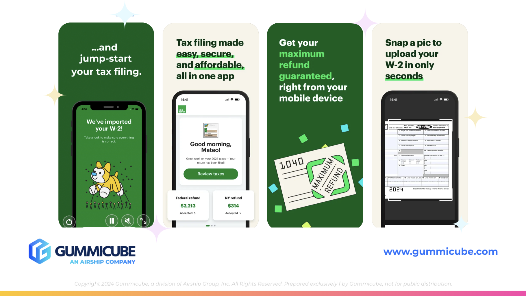
To better understand ASO opportunities, comparing TurboTax to its competitor, H&R Block Tax Prep, reveals important insights. H&R Block has implemented a well-rounded ASO strategy that not only enhances visibility but also improves user engagement and conversion rates. By analyzing their approach, we can identify key elements that TurboTax could adopt to strengthen its own App Store presence.
H&R Block’s App Store listing showcases a refined approach to ASO. The combination of bold text and contrasting colors ensures that key features stand out immediately. Additionally, the use of all available screenshot slots maximizes the opportunity to highlight app functionalities, something TurboTax could emulate to enhance its conversion rates.
By taking a more strategic approach similar to H&R Block, TurboTax could enhance its ASO efforts and boost its overall conversion rate. With the tax preparation category being highly competitive, standing out with well-optimized creatives is essential for success. A stronger emphasis on visual clarity, bold design, and full utilization of App Store assets would give TurboTax a greater competitive edge.
For app developers navigating competitive categories, evaluating ASO strategies is essential. Optimizing elements like screenshots and video placement can make a substantial difference in conversion rates.
TurboTax’s strengths in ASO highlight the power of strategic optimization, but there is always room for improvement. Gummicube is here for developers looking to refine their approach. Let’s connect and see how we can give your app a competitive edge.
Discover how Orbit can boost visibility and conversions with smarter keywords, optimized creatives, and a stronger App Store presence.

Explore how Home Contents can improve its App Store listing with smarter ASO tactics, from stronger keywords to better screenshots and video strategy.

Discover how onX Offroad can enhance its App Store presence with smarter ASO strategies, from metadata tweaks to creative optimizations.