Unleashing Success: ASO Breakdown of Pupford's Puppy Training App
Posted on April 24th, 2025
A deep dive into Pupford’s App Store listing, with tips to improve visibility, boost conversions, and turn more browsers into loyal users.

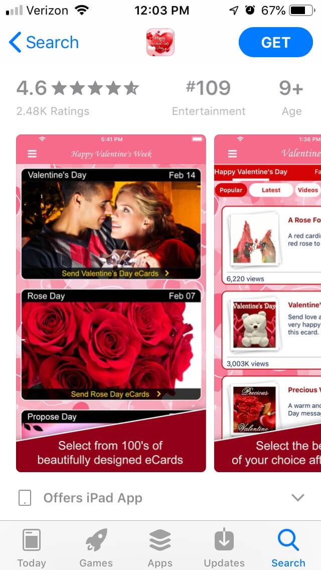
It’s Valentine’s Day, which means users are going to be searching the App Store and Google Play Store for apps that can help them tell their loved ones how they feel. As there are several apps including “Valentine’s Day” in their names and descriptions, it takes proper App Store Optimization to rank near the top of the search results. So for this week’s App Store Spotlight, we’ll take a look at “Valentine’s Day Cards & Wishes” by 123Greetings.com to see if the store algorithms love it.
On the Apple App Store, “Valentine’s Day Cards & Wishes” manages to rank highly for several card and Valentine’s Day related terms. It’s the third-highest app under searches for “ecards” and “valentine,” as well as the 4th app for “valentines day” and “free ecards.” Its rankings begin to decrease for terms like “valentine app,” where it’s ranked #12, and “love cards,” where it’s #15. Although it does offer animated gifs, its ranking for gif-related terms is on the lower end, as it ranks #68 for “gif maker.”
The creative set for “Valentine’s Day Cards & Wishes” is very pink and red, in theme with the colors associated with the holiday. The first image includes a set of several cards that invoke romantic imagery, starting off its creative set on a strong foot.
The five images it uses intend to show the user through the process of selecting and sending a card. Each one transitions to the next by showing the next step in the process, although it does make the images a little repetitive.

For instance, one picture includes callout text saying: “Select the best card of your choice after viewing it,” which is a little lengthier than recommended for callout text. The very next picture shows the same screen only with a card selected, and the callout text just says: “That’s your Valentine’s Day card!” The remaining images all show the same card, so it doesn’t show the variety of cards that the app has to offer.
There is room for extra images, so the app could demonstrate the variety of cards it has for different tones, relationships and so on. There is no mention of the gif options either, so anyone looking for gifs won’t see what the app has available.
While each image features callout text, they’re in small, barely noticeable text at the bottom of each image, so they don’t stand out. While they’re instructional, they’re also a bit unwieldy. Going back to the one that says “select the best card of your choice after viewing it,” that could easily be shortened to a much snappier “Pick your favorite card.”
The app’s title, “Valentine’s Day Cards & Wishes,” takes up the full 30 characters Apple allows. Each word is an important keyword for the app, so it’s utilizing the title space nicely.
The subtitle, “Exclusive Video & Gif Cards,” repeats the use of “cards,” but still utilizes important keywords. “Exclusive” forms some phrases, such as “exclusive videos,” which it ranks #2 for, although most of the phrases it creates are not entirely relevant. It could benefit the app to find a more compelling keyword for the subtitle.
The app’s description could use a little reformatting to better appeal to users. The introduction is a lengthy paragraph, which could be split into smaller lines that are easier for users to read at a glance.
It does include a list of the various card categories, and the constant use of terms like “valentine” throughout it helps build relevancy for Search Ads campaigns. But it follows the numbered list up with a lengthy text list, which is a jarring shift for users.
The features are listed in bullet points, which is good for ease of reading. Yet without category headers, it has them all bundled together into a single list; it could provide more information and get the point across to users better by making category sections, listing things like “Valentine Cards” and “GIF eCards.”
On Google Play, the “Valentine’s Day Cards & Wishes” app struggles to reach the search rankings that it has on iOS. It’s the sixth app in searches for its own name, and the 153rd app for “Valentine’s Day.” It ranks at #16 for “send cards” and #24 for “holiday cards,” while other the other keywords it ranks for are less specific terms like “e card” (#47) and “photo postcards” (#122).
The screenshots on Google Play are identical to those on iOS. While they do contain imagery with a strong connection to Valentine’s Day, the small but lengthy callout text is less effective than short but eye-catching text would be. The images still walk users through the process of selecting and sending a card, but there’s little variety to the cards shown as a result, and there’s nothing to show the video or gif options.
The app’s description is also identical to the iOS version. While the lists it features do include important card-based keywords, they’re not used enough to help build its ranking for them. For instance, it’s the 48th app under searches for “cards for him,” and the 99th app for “love cards,” although those are both listed as card options.
The description lists several other holidays, but it includes them in a single line, so Google’s algorithm won’t pick up on them as potential keywords. While some lines do begin with relevant terms, like “send cards” or “interesting video cards,” many more begin with phrases that are not relevant to the app, like “enjoy the flavor of each new event,” which it ranks #21 for.
If it were to reformat the description to split the large feature list into smaller, bulleted feature sets, it could improve its readability and help its indexation for the keywords it wants to target.
Cupid’s arrow may have struck for “Valentine’s Day Cards & Wishes” on the Apple App Store, but it’s not getting the same love from Google Play. This is another instance where using the same creatives and description across both stores backfires – the way the algorithms work for the different stores mean the tactics that work for one may not work on the other.
The app could potentially improve its visibility and keyword rankings if it were to reformat its descriptions and improve its creatives on both stores, keeping the different ways they work in mind. If it wants to see the same success on Google Play as it does on the Apple App Store, it needs to adjust its tactics for each – otherwise it’s like trying to send the same Valentine’s Day card to two different people.

A deep dive into Pupford’s App Store listing, with tips to improve visibility, boost conversions, and turn more browsers into loyal users.

Discover how Orbit can boost visibility and conversions with smarter keywords, optimized creatives, and a stronger App Store presence.

Explore how Home Contents can improve its App Store listing with smarter ASO tactics, from stronger keywords to better screenshots and video strategy.