Posted on November 2nd, 2019
Gwent: The Witcher Card Game recently hit the App Store and is already ranking strong. While it is not yet available on Google Play, analyzing its App Store Optimization can provide good insights for developers looking to compete or learn from its success, as well as see how the app’s page can improve and work should the game be made available on Google Play.

Posted on October 29th, 2019
The Escape Game apps are a series of mobile games by Jammsworks Inc, each with a different theme. They’re mobile apps based off escape rooms, where users must uncover hidden clues and solve puzzles to escape the room. With Fall well underway, apps with an autumnal theme can capitalize on seasonality to grow. For this week’s App Store Spotlight, we take a look at Escape Game: Autumn and its App Store Optimization.

Posted on October 22nd, 2019
Dumb Ways to Draw is a game where players use the touchscreen of their mobile devices to draw on the game screen and get bean-shaped characters to safety. The game recently updated for Halloween with special event levels and is featured on the iOS App Store. It also happens to be the subject of this week’s App Store Spotlight, so let’s take a look at Dumb Ways to Draw and see if its App Store Optimization helps it draw in users.

Posted on October 15th, 2019
CodyCross is a crosswords app with scenic backgrounds and an alien mascot character. For a subscription fee, users can get weekly puzzles of varying difficulties and themes. Can CodyCross solve the puzzle that is App Store Optimization, or does it get lost in the search results like a well-hidden word in a puzzle? For this week’s App Store Spotlight, we take a look at CodyCross.

Posted on October 8th, 2019
Serial Reader is an app designed to help people read classic works of literature in bite-sized pieces. The app boasts over 650 books in 20-minute issues, customizable features, badges and more. For users to enjoy their books, first they must find the app, which is why App Store Optimization is important. This week’s App Store Spotlight focuses on Serial Reader and if its ASO makes the app’s store pages a must-read.

Posted on October 1st, 2019
Nintendo’s Mario Kart franchise has made its way to mobile phones with the long-awaited Mario Kart Tour. While the app is seeing early success from the brand’s popularity, it still needs App Store Optimization if it wants to race with the top of the pack. For this week’s App Store Spotlight, we take a look at Mario Kart Tour and see if its ASO is enough to give it a turbo boost, or if another app can beat it to the finish line.

Posted on September 24th, 2019
Warhammer 40,000 is a popular miniatures wargame with an expansive lore. Games Workshop and Pixel Toys have brought that story to mobile games with “Warhammer 40,000: Freeblade,” a mobile game that recently updated for iOS 13. Do the game’s App Store and Play Store pages draw in users, or is it overlooked amongst the mobile games in the stores? Does the app capitalize on being featured for its iOS 13 capabilities? We explore that in this week’s App Store Spotlight.

Posted on September 17th, 2019
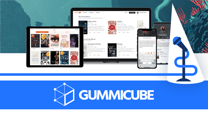
Wattpad is an app designed for writers and readers alike to connect. The app’s description boasts that many top-selling authors got their start on Wattpad, but for a writer to get discovered on Wattpad, first they must discover the app in the store. For this week’s App Store Spotlight, we look at Wattpad and see if its App Store Optimization makes it a must-read.

Posted on September 10th, 2019
Kickstarter is a crowdfunding site that has helped launch games, films, music projects and much more. Its mobile app allows users to back projects and campaigns from their smartphones, but just like a good Kickstarter campaign needs to be discoverable, so too must apps have good visibility. For this week’s App Store Spotlight, we take a look at Kickstarter’s App Store Optimization and see if it can give its mobile marketing a boost.

Posted on September 5th, 2019
New Pokémon apps typically take off fast in the App Store and Google Play Store, starting with Pokémon GO and continuing on to its latest app: Pokémon Masters. This new mobile game is starting off strong, having used pre-ordering to build momentum and keyword indexation before it even launched. Now that it’s live on the stores, does it have the App Store Optimization necessary to be the very best? For this week’s App Store Spotlight, we take a look at Pokémon Masters and see if it can master the app stores.

Posted on August 27th, 2019
Smart phones. For all the value they bring to work and life, smart phones can sometimee be a distraction. One of the millions of apps that aims to solve this problem is Forest, an app that turns time spent away from the phone into points that users can redeem to help plant real trees. The app can help trees grow, but is it built in a way to help its keyword rankings and visibility grow in the App Store and Play Store? For this week’s App Store Spotlight, we turn our focus to Forest.

Posted on August 20th, 2019
VRV is a video streaming app offering licensed content from a range of networks, creators and distributors. Users can watch classic cartoons, live action shows from overseas, web originals and more. Before they can watch anything, though, they need to find the app. For this week’s App Store Spotlight, we take a look at VRV and see if its App Store Optimization gets users to tune in.
